What do color blind people actually see?
5 min read
The most common guess is that color blind people see the world in black and white. Almost nobody does. Color blindness - more precisely, color vision deficiency (CVD) - usually means certain colors get confused with each other, not erased. Reds, greens, browns and oranges collapse toward one muddy band; a ripe and an unripe tomato can look like the same fruit.
It affects roughly 1 in 12 men and 1 in 200 women - so most people know someone with it, even if it never comes up. Here's what it actually looks like.
It's not black and white
True total color blindness (achromatopsia - seeing only in shades of grey) exists, but it's extremely rare. The everyday experience for the vast majority is a shifted and flattened palette: most colors are still there, but several pairs that look obviously different to full-color vision become hard or impossible to tell apart.
Which pairs depends on the type. There are three to know.
Red-green: the common one
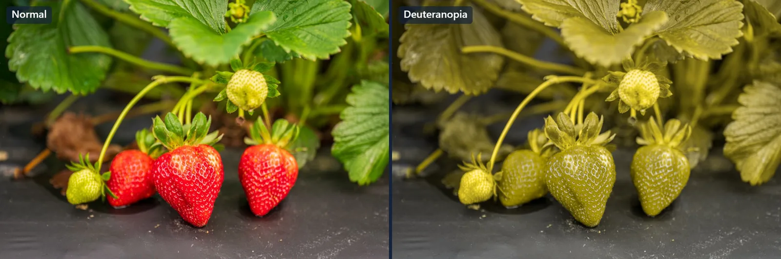
Red-green CVD - deuteranopia (weak/absent green cone) and protanopia (weak/absent red cone) - covers the large majority of cases. Reds, greens, browns, oranges and olive tones drift together. Pink can read as grey; purple can lose its red half and look plain blue.
Every side-by-side on this page was made with Satura's show-a-friend tool - point it at your own photo to make your own.
Notice it isn't darker or greyer overall - it's that the separation between colors is gone. Two things that clearly contrast for most people sit right on top of each other.
Why reds can look dark (protanopia)
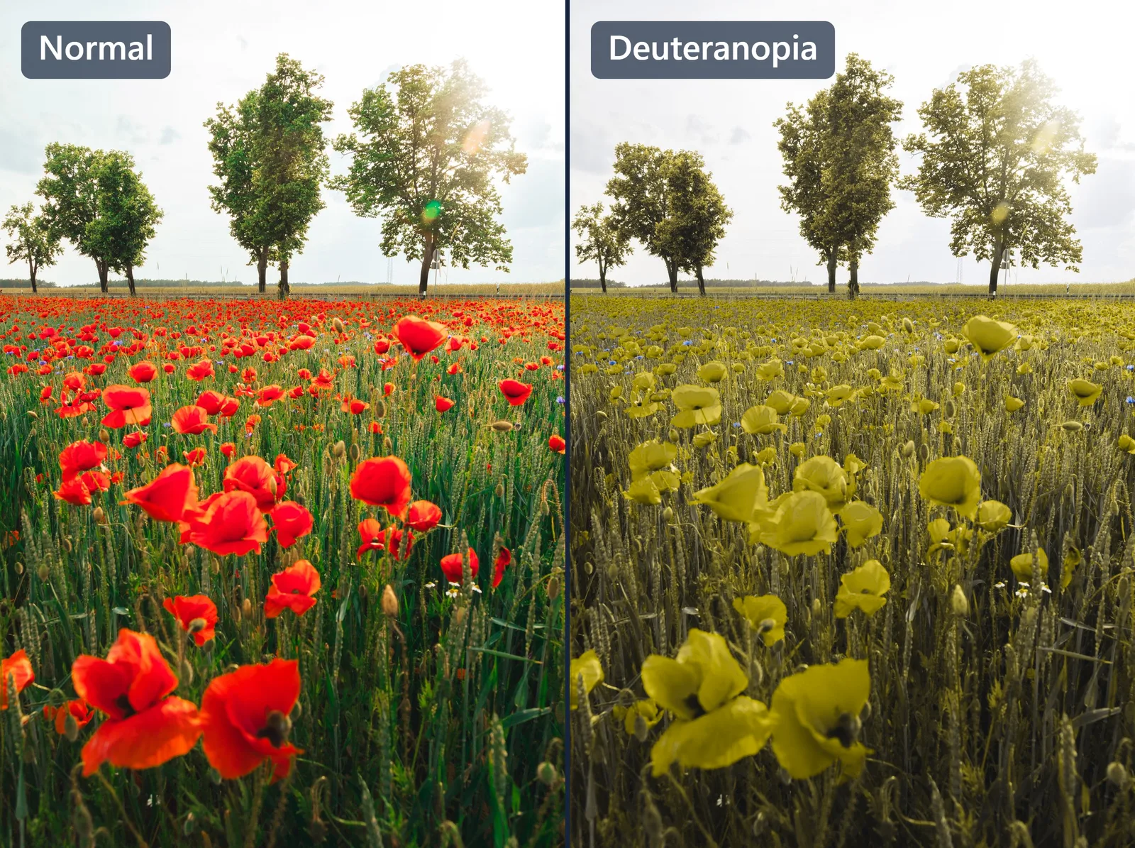
Protanopia and deuteranopia look broadly alike - both are red-green types, so to someone with full color vision the two simulations can seem like the same olive-toned filter. The giveaway is brightness. The red cone carries most of the eye's sense of brightness, so protanopia doesn't just shift reds, it dims them - a bright red turns dull, brownish and much darker, and a deep red can sink almost to black. Deuteranopia leaves those same reds brighter and more yellow.
The same poppy field shows it. Under deuteranopia, the red flowers turn a bright yellow-olive that still stands out from the wheat:
Under protanopia, the very same flowers go darker and muddier, sinking into the field - which is why a red brake light or LED can be genuinely easy to miss:
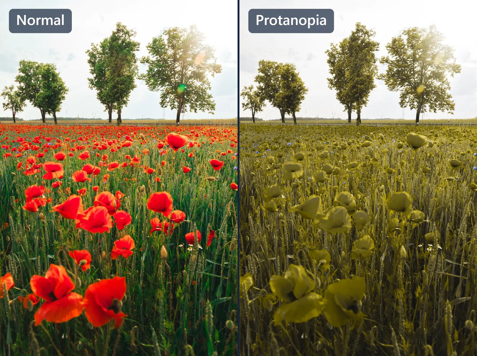
It's the most reliable everyday tell: if reds look dim rather than just off, that points toward protanopia. (Our guide on protanopia vs deuteranopia goes deeper.)
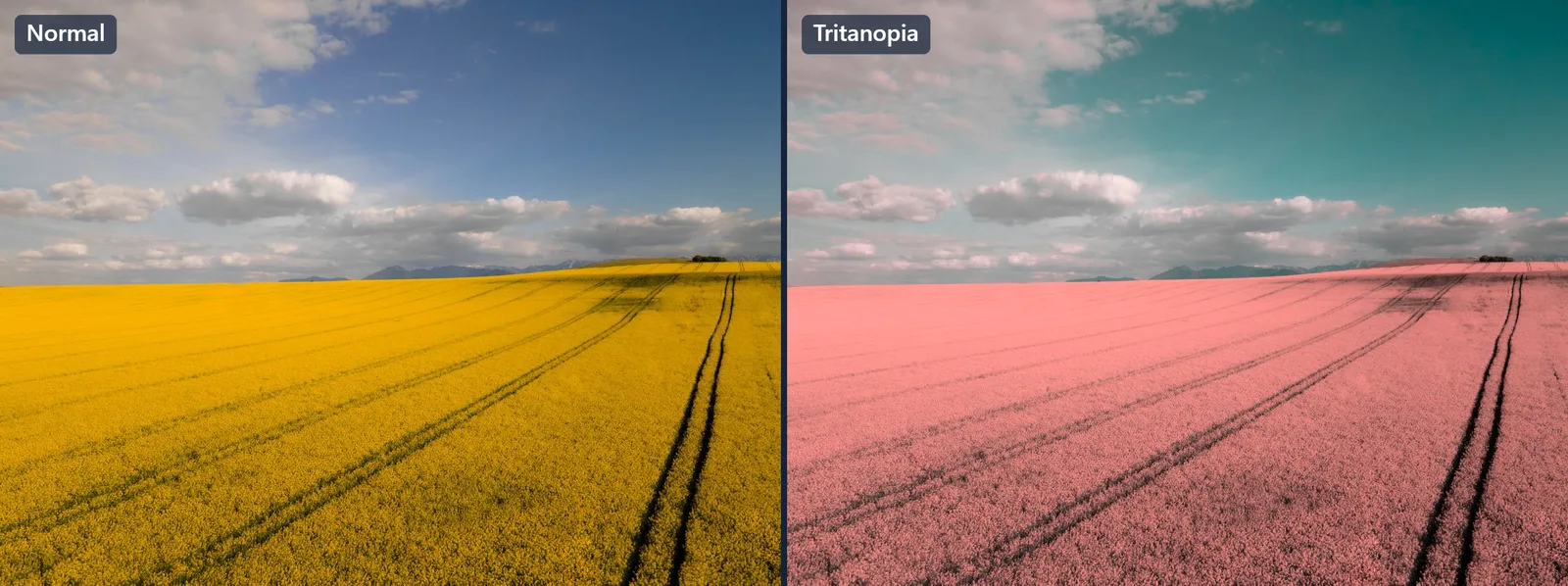
Blue-yellow: the rare one
Tritanopia (blue-yellow CVD) is much less common and usually acquired rather than inherited. Here blues and greens blur together, and yellow can fade toward pink or grey. Sunsets, water and foliage are where it shows up most.
Where it actually bites
The simulations make it abstract; daily life makes it concrete. The same handful of confusions show up everywhere:
- Traffic lights - fine by position, but a single amber-vs-red signal, or a red light against a bright sky, can be ambiguous.
- Ripeness - red vs green apples, a strawberry hiding in its leaves, whether the meat is cooked.
- Status indicators - red/green LEDs, "pass/fail" dots, battery and charging lights.
- Charts and maps - red-vs-green lines, heatmaps, transit maps where two routes share a hue.
- Sport - telling two teams apart when the kit colors confuse.
None of this is "not seeing color." It's specific, repeated, low-grade friction - which is exactly why design that doesn't rely on color alone helps everyone.
See it on your own photos
A picture of someone else's fruit bowl only goes so far. Satura's color vision simulator recolors your photos - or your live camera - the way each type of CVD would, with a slider from mild to full, so you can compare them side by side. The show-a-friend tool makes the exact normal vs. simulated images in this post, ready to share. And the correction filter does the reverse: it pulls confusable colors apart so they're easier to tell apart.
If you're curious about your own vision, the free color blindness screening gives an instant, private result on your device.
How accurate are these simulations?
Honestly: they're a good approximation, not a perfect window into another person's eyes. They model the average dichromat, and real CVD is a spectrum - many people have a milder anomalous version and see more color separation than a full simulation suggests. They're built for understanding and for designing accessibly, not for diagnosis - and the same caution applies to any online color-blind test. For a clinical assessment, see an eye-care professional.
What these simulations are genuinely good at is the thing this whole page is about: letting full-color vision finally see the confusion instead of just hearing it described.
Keep reading
- How accurate is an online color blind test?Online Ishihara-style tests are a useful first screen, but screen calibration and lighting affect results. Here's how to get the most reliable reading at home.
- Living with red-green color blindness: practical everyday tipsReal-world strategies for color vision deficiency - cooking, clothes, screens, work and more - plus free tools that help you check colors on the spot.